Table of Contents
General Comments
Why is it important to read the information on tubes of oil paint?
Virgil’s Opinion:
One reason is to know what you’re working with. Several paint companies are now calling things burnt sienna, raw sienna, raw umber and burnt umber that are not those pigments at all, but mixtures of synthetic pigments. These substitutes do not share the same characteristics as the real pigments they’re named after. Some are more transparent, some more opaque, some are even the wrong hue, and the drying characteristics are different. I’m opposed to this practice because it generates confusion.
So when you read or hear me speak of burnt sienna, raw sienna, raw umber or burnt umber, please understand that I’m speaking of the real stuff, not the synthetic substitutes.
If the brand you’re using does not print what pigments are in the paint on the tubes, contact the company and ask what the pigments are. If they won’t tell you, then let them know you won’t be buying any of their products unless or until they comply with all the ASTM standards for the products in question. Without that information, you won’t know what you’re getting.
I leave it to each artist to decide what to use and what not to use, but the best choices can only be made when we understand the nature of the materials and what they are best suited for and what the potential problems are.
Pigments Organized by Hue Families
Select a color chip below to launch a page listing the common pigments found for that color
For each pigment, we offer:
- the pros and cons of using that pigment, based on Virgil’s experience and observations
- technical links, and
- a graphical representation of the pigment’s qualities.
Further down this page, you’ll find a list of the terminology we use and the pigments organized by quality.
Terminology
Select a tab below to see a description of each term or pigment quality. You will find these terms used frequently throughout the assessments of pigments on this site.
Pigment Name
This could be the official name in the Color Index (third edition 1997), the name given by the original manufactuer, the actual chemical name, or the traditional historic name.
Color Index Name Code
The first two letters describe the general pigment color and the number is the individual pigment identifier. For example, PG-17 is the color index name code for Chromium Oxide Green.
Opacity - Transparency Ratio
This is a general reference. Many pigments exist in both transparent/opaque versions or can be manipulated by paint manufacturers).
Possible values:
- Transparent
- Semi-Transparent
- Semi-Opaque, and
- Opaque.
This subject is covered on pages 131-132 of Virgil’s book.
Lightfastness Rating (by the ASTM)
Lightfastness refers to the ability of a pigment to hold its color and resist fading or changing over time. Most professional art pigments these days are considered permanent (lightfast).
Possible values:
- I, Excellent — reliable not to fade or change over time.
- II, Good — sufficiently lightfast for fine art painting.
- III, Poor — can be expected to fade or change color in an unacceptably short period of time and should be avoided.
- IV, Fugitive/Very Poor. — same as above.
The subject of lightfastness is covered on pages 123-124 of Virgil’s book.
Oil to Pigment Ratios
This is defined as the ratio by volume of the binding oil to the pigment in a paint.
Possible values:
- Relatively Lean
- Moderately Lean
- High in Oil Content, and
- Very High in Oil Content.
Ideally, one should paint “fat over lean”. Paint containing a lower percentage of oil (lean) is best used in the early stages of a painting, followed by increasingly “fatter” paints (paints with a higher percentage of oil) in the latter stages.
The subject of oil-to-pigment ratios is covered on pages 125-126 of Virgil’s book.
Tinting Strength
This quality refers to how much of a given paint is needed to tint a mixture the desired amount.
Pigments of high tinting strength are useful in underpainting, mixed in small quantities with lead white.
Tinting Strength is covered on pages 131-132 of Virgil’s book.
Toxicity
Possible values:
- Low hazard, but do not handle carelessly
- Possible Hazard if improperly or carelessly handled
- Hazardous, use appropriate precautions for handling toxic substances, and
- Extremely Toxic, only attempt working with this pigment (especially the dry form) in laboratory conditions and with proper safety equipment.
The hazardous properties associated with the pigment are based on the literature. It is assumed professional artists will use at least ordinary care when handling all paints or pigments.
Drying Rates
Possible Values:
- Fast-drying
- Average-drying
- Slow-drying, and
- Very slow-drying.
Problems can occur when faster-drying paints are applied over slower-drying paints.
See Pages 129 – 130 “Drying Rates” in Virgil’s book.
Pigments Listed by Opacity and Transparency
Source: Page 131 of Virgil’s book
- Viridian
- Green Earth
- Ultramarine Blue
- Ultramarine Violet
- Rose Madder * not lightfast
- Manganese Violet
- Ivory Black
- Cobalt Violet
- Indian Yellow * not lightfast
- Quinacridone Gold
- Transparent Oxide Red
- Prussian Blue
- Transparent Oxide Yellow
- Phthalocyanine Blue
- Transparent Oxide Brown
- Phthalocyanine Green
- Green Gold
- Burnt Sienna
- Davy’s Gray
- Raw Sienna
- Cobalt Blue
- Transparent Gold Ochre
- Aureolin * not lightfast
- Some Burnt Umber
- Green Earth
- Yellow Ochre
- Some Raw Umber
- Yellow Ochre
- Greenish Umber
- Vermilion * poor grades are not lightfast
- Some Burnt Umber
- Deep Ochre
- Burnt Green Earth
- Gold Ochre
- Flake White
- Mars Black
- Titanium White
- Mars Yellow
- Naples Yellow
- Mars Orange
- Some Cadmium Yellows
- Some Yellow Ochres
- Cadmium Reds
- Mars Red
- Cadmium Orange
- Mars Violet
- Venetian Red
- Mars Brown
- Indian Red
- Brown Ochre
- Light Red
- Caput Mortuum
- English Red
- Pozzuoli Earth
- Terra Rosa
- Red Ochre
- Chromium Oxide Green
- Cerulean Blue
Pigments Listed by Oil-to-Pigment Ratios
Source: Page 126 of Virgil’s book
- Chromium Oxide Green
- Cadmium-barium reds
- Venetian red
- Cadmium reds
- Indian red
- Cadmium vermilion
- Vermilion
- Cadmium-barium yellows
- Cobalt violet
- Cadmium yellows
- Titanium White
- Yellow Ochre
- Naples Yellow
- Deep Ochre
- Mars violet
- Phthalocyanine Blue
- Phthalocyanine Green
- Ultramarine Blue
- Cadmium Orange
- Ivory (Bone) Black
- Raw Umber
- Raw Sienna
- Burnt Umber
- Mars Yellow
- Burnt Sienna
- Mars Orange
- Caput Mortuum
- Mars Brown
- Green Earth
- Mars Black
- Cerulean Blue
- Prussian Blue
- Rose Madder
- Alizarin Crimson
- Cobalt Blue
- Viridian
- Manganese Violet
Pigments Listed by Drying Rates
Source: Page 130 of Virgil’s book
- The Cadmiums
- Vermilion
- Rose Madder
- Ivory Black
- Titanium White
- Ultramarines
- Cerulean blue
- Green Earth
- Yellow Ochre
- Naples yellow
- Cobalt Blue
- Cobalt Violet
- Chromium Oxide Green
- Viridian
- All Mars colors
- Raw Sienna
- Most Earth Reds
- Burnt Umber
- Raw Umber
- Phthalocyanine Blue
- Phthalocyanine Green
- Prussian Blue
- Lead White
- Burnt Sienna
- Davy’s Gray
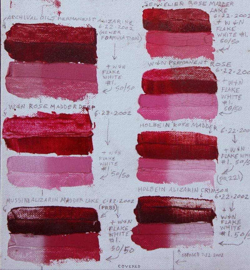
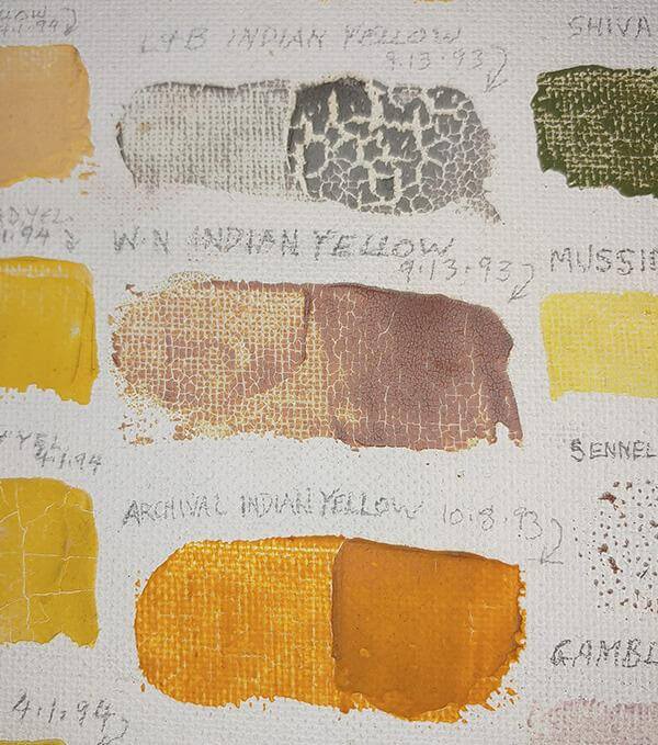
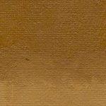
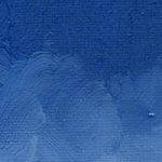
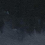
Lightfastness Testing: Virgil's Method
Virgil’s notes: Here is how I test paints for lightfastness:
On a canvasboard primed white, make horizontal rectangular swatches of each paint to be tested, using a palette knife to apply it in two thicknesses: one thick, and one scraped thin. The thin side will test how the paint performs as a glaze. One should be on top of the other, so each extends to both ends of the rectangle.
Make another swatch of the same paint mixed with the white you normally use, to make a tint halfway between the full-strength color and white. Do as you did with the full-strength swatch, spreading the top half thickly and the bottom half thinly (or vice-versa).
Do likewise with each color you want to test, arranged one above the other on the panel. Let them dry.
When the samples are all dry, cover half of each one with a strip of heavy black paper, pinned to the panel, so each panel has one-half covered and one-half exposed. Place the panel in a window that gets direct sun for as much of the day as possible. After two or three months, remove the black paper mask, and compare the exposed halves with the covered halves, to see if there is any change between them. Replace the mask, and put the panel back in the window. Check periodically over the months (and years) to see if anything changes. If there is no fading or darkening of the exposed portions after two years in the sun, then you may get the idea that the pigment is sufficiently lightfast.
I have left some of my test panels in the window for as much as 16 years, just to see which colors would fade and which would not. But 2-4 years is enough to give a pretty good idea. It’s not totally scientific, but it provides a good comparative indication anyway.
Two examples of lightfastness tests are shown below: one for alizarin crimson and one for indian yellow.